Thursday, 20 December 2012
Question 3: What kind of media institution might distribute your media product and why?
 What I was planning for my distribution strategy of my magazine was using a similar ploy as to what Vice magazine do with theirs by doing it independently, sending it to niche, specialist shops, such as game stores, arcades and mana bars (bars for gamers in normal language). I have plans of them being given away for free and all the costs of the magazine being paid for by any advertising that might be in the pages. My audience is young, in the 16 - 25 agre range, and would be the kind of people who would take advantage of a free magazine just being handed out, instead of paying for it. Despite this, I believe that if the magazine were to be more of a success, supporters wouldn't mind being charged a small fee if the creators were to invest in a distributor. This distribution technique will hopefully appeal to them, as it is a different and unique scheme, that is rarely used.

Another reason that this will also appeal to them as it will be found in places they likely frequent, and thus will be easily obtained without much hassle. I also plan to use a multi-platform strategy by having a website/online retailer, which will allow readers to acsess the magazine online. This will be beneficial to readers from other countires, as in a traditional case, they may want to read the magazine, but be outside of the publishing area and wouldn't be able to access it without the internet. However, this strategy of independent distribution will cause quite a large impact on the profit of the magazine however, as it is being given away for free. To overcome this, there will be advert space for sale in the magazine, the costs of which will pay for the distribution.

Question 5: How did you attract/address your audience?
For this question, I did various things, in order to get a response from my target audience.
 This includes making a facebook group and inviting various people to join it.


I also made a tumblr post so that my followers could comment on what they thought about it in the form of a text post back to me.


Update: One reply on the tumblr post, another reply on the Facebook post. Hopefully there will be more posts on facebook in the evening.
Wednesday, 19 December 2012
Monday, 17 December 2012


Friday, 30 November 2012


Sunday, 4 November 2012


Thursday, 25 October 2012


Wednesday, 17 October 2012
Planning
After some research into popular music magazines, I have decided that my chosen music genre would be electro, though more specifically chiptune. I have chosen to do this because of the lack of magazines revolving around this genre, as well as my own personal liking for it. Because of my choice, I will be focusing all of my research on magazines that fit the electro genre (of all kinds, including dance music, dubstep, video game music etc.) as well as analysing the typical genre conventions around it and choosing suitable aspects to eventually include in my own magazine.
My main article is going to be about "The Music of Homestuck" which will be covering the amount of artists, albums and songs that are used in the collaborative project, all across the internet. This is going to be a brilliant subject of focus, especially because I'm going to a meetup for fans of Homestuck soon, and so will be able to take a lot of photographs for my cover and for the double page spread.
I intend to experiment with a lot of potential shots and photos, but I also intend on photographing in a safe environment.
The audience that I intend to release this magazine to is most likely radical hedonists, who like to break norms and are interested in things others may not be. Perhaps they are a little stuck in the past, and indulging their lost childhood with old video games and music that reminds them of when they didn't know the world sucked. I also suspect the age range to be from 16-25, maybe pushing it in some scenarios. People outside of this barrier would probably label the older fans as "big kids."
Thursday, 11 October 2012
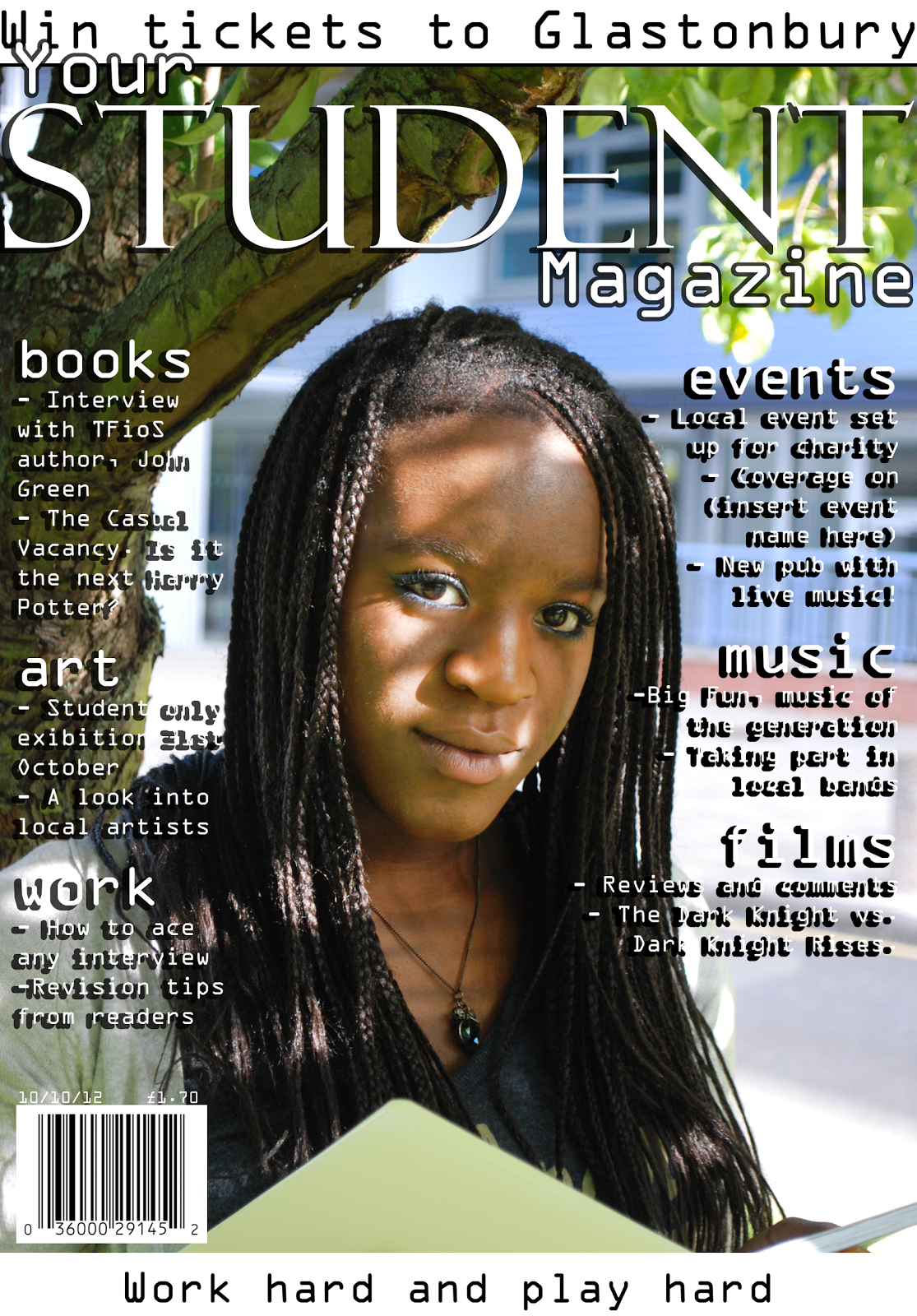
Ideal contents.
Work:
Books:
- Interview with John Green, author of The Fault in our Starts (featured)
- The Casual Vacancy. Is it the new Harry Potter?
- Book recommendations and reviews from readers
- Book of the week
Art:
- Spooky student only exhibition
- A look into local artists
Work:
- How to ace any interview
- Revision tips from readers
- Used cars cheap. Why buy new?
Play:
Events:
- Local even set up for charity. Music, drinks and fun!
- Exclusive coverage on Edinburgh Fringe Festival
- New bar with live music! Opening night 15th October
Music:
- Big Fun, music of the generation
- How to take part in local bands
- Why the charts are rubbish
- Top ten songs of the week
Films:
- Reviews and comments
- The Dark Knight vs Dark Knight Rises
- Read It First.
Magazine cover and contents
After a week or so, I have finally composed my magazine cover for my student magazine.


Monday, 1 October 2012
Production schedule
- First I will photograph my modal(s) to fit my front cover design. Various props and make-up options are possible, though not entirely necessary. Experiment with various degrees of light and shadow (etc.) as well as different backgrounds (maybe working with a green screen.)
- Second, I will think of possible cover lines (this plays into working on the contents page) and experiment with fonts for the title.
- Thirdly, I will arrange all of these things together, making sure that the cover lines are clear, but also doesn't obstruct the modal's face, so that audiences are still drawn in and want to buy the magazine.
- Finally, I need to put it all together with appropriate fonts and images.
Friday, 28 September 2012
Magazine covers
Our fifth task in the first module was to create a rough design for a potential magazine cover. I composed three possible ideas, which I sketched up (incredibly roughly) before deciding which one to go with.

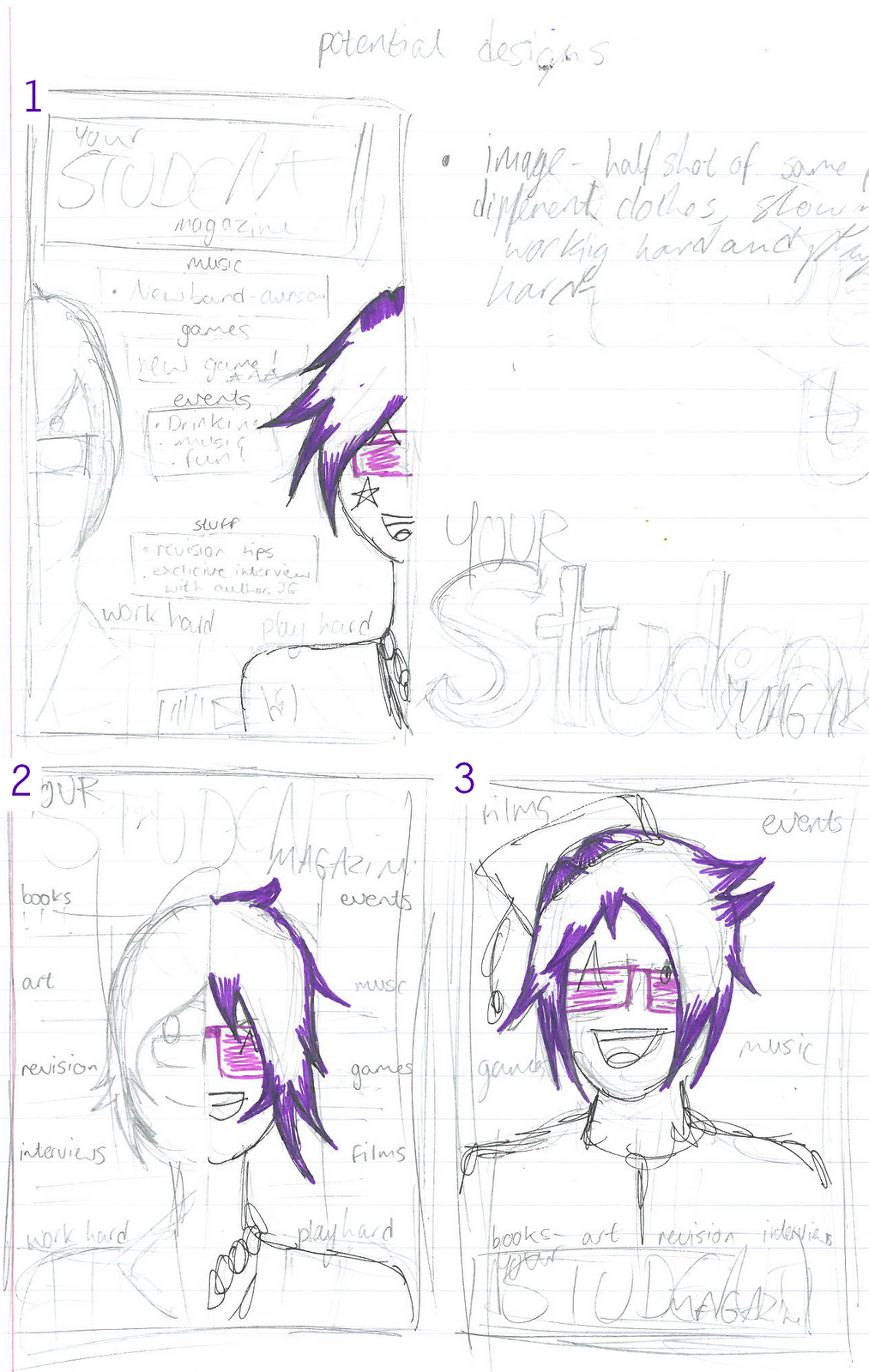
I was told that one wasn't a medium shot of a student (which I can see, as the people have their faces cut in half)
The second sketch is the one that I'm going to work with, as it includes everything the first sketch has, as well as the medium shot.
The third sketch is a little boring, to be honest.
I sketched the second one up in a better style, to get more of an insight as to what it would look like.
Thursday, 27 September 2012
How will I communicate these connotations? (referring back to The Student Magazine)

- Hard-working - A way that one of the magazines I analysed did this was by making the cover photo a picture of a boy doing work. To the side of him, he has a board, with equations and scribbles on them. For all we know, he could have been doing something else entirely, but we trust the magazine that they're showing us a hard-working student, as opposed to a lazy one. This could, of course, be an option. Another option is to have lots of cover lines showing for more educational side of the magazine, rather then the most interesting articles and the ones my target market would like to read. I think I'm going to go with the first choice rather then the latter, because I have reason to believe that it would sell better with those in my target market.
- Fun, energetic, lively - The first magazine I analysed had a lot of interesting articles, highlighting television, gaming, gadgets, fashion and music, showing that some students will be interested in other things besides studying and school, that they like to have fun as well. The lively could easily be achieved with right colour choices and bright colours with the images (example, the white text over the green grass. White text stands out more on any colour)
- Simple, easy, tidy - As you can see, each headline is laid out clearly and easily, the interesting articles at the centre of the page (revision tricks uncovered, all caps!), the other main articles to the left of the page (television and gaming, oddly) and articles that not everyone may be into at the bottom of the page (gadgets, fashion and music) Each tag for the article block are in a different colour, sectioning it off well, and let us know what we want to look at.
List of connotations I hope to send
- Hardworking - I'd like to show that students/teens aren't as lazy as the media portrays us to be and that we deserve a decent amount of respect.
- Fun, lively, energetic - I don't, however, want to seem pushy or boring. I want to be able to sell the magazine, as well as show that most students work hard. So, by mixing the two together, I should be able to maintain a perfect balance.
- Simple, easy, tidy - I don't want it to look complicated or messy, so I plan to arrange the front cover and the rest of the magazine neatly. This also does a good job as to not overwhelm the consumer, and also gives off the impression that a lot of time and thought went into it, as opposed to it being thrown together last minute.
Audience profile
Considering the fact this magazine is ideally going to be bought and sold to students, I have to construct a detailed audience profile for my ideal reader. However, this task is going to be relatively easy because the ideal reader is a student, which what I file under.
- A student who works hard, but wants something interesting to do when they're not.
- Someone lacking money most of the time, and don't want to spend whatever they do have on an expensive magazine.
- Someone interested in all kinds of subjects, including music, gadgets, books and films, as well as tips for improving studies.
- Ideally between the ages of 16-23.
- Reasonably responsible and trusted by others.
- An achiever in most respects, but never afraid to push the limits into radical.
- Listens to a lot of indie rock and roll, straying from the mainstream as much as possible. Would easily be more interested in articles featuring those kinds of bands.
- Coverage of news and recent trends would also be preferred by some.
- Someone who doesn't want to read a magazine and feel the writer is better then them. Casual and informal language would be preferred over formal.
- Maybe considered a bit of an outcast in some respects.
- A C1-C2 on the Jicnars scale.
Wednesday, 26 September 2012
Further research and analysis

Image source: http://www.thestudentmagazine.co.uk/themagazine.php
You could anticipate that this would be a professionally made magazine, designed for students. You can guess this by the image, detonating a boy working hard on homework or school work which connotates students being hard-working individuals. It could be argued that it wasn't necessarily professional because of the cover lines being about television and gaming, but by my guess, this is not only a magazine for students, but also for students who work hard, and play hard, this magazine particularly highlighting the play hard part.

Image source: http://www.magcloud.com/browse/issue/190627
While the last magazine I analysed encouraged the fact that students should have free time, this one is all about colleges and how to choose the best one, shown in the coverlines. We could perhaps guess that this particular issue of the magazine didn't have a lot of thought put into it, because of the clashing colours and lack of anything incredibly interesting in the left side. It knows it's target market well though and is probably popular within the demographic too.
Monday, 24 September 2012
First post 8)
Hi there! Thea Bamber, head of the Mituna Captor appreciation club, here, posting research and media like stuff.
Subscribe to:
Comments (Atom)