Friday 28 September 2012

Magazine covers

Our fifth task in the first module was to create a rough design for a potential magazine cover. I composed three possible ideas, which I sketched up (incredibly roughly) before deciding which one to go with.
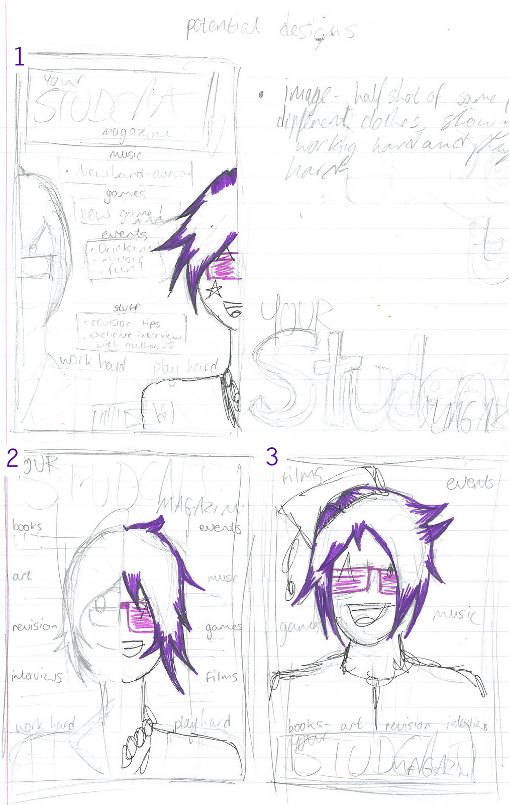
I was told that one wasn't a medium shot of a student (which I can see, as the people have their faces cut in half)
The second sketch is the one that I'm going to work with, as it includes everything the first sketch has, as well as the medium shot. 
The third sketch is a little boring, to be honest.

I sketched the second one up in a better style, to get more of an insight as to what it would look like.                                                               

Thursday 27 September 2012

How will I communicate these connotations? (referring back to The Student Magazine)


  • Hard-working - A way that one of the magazines I analysed did this was by making the cover photo a picture of a boy doing work. To the side of him, he has a board, with equations and scribbles on them. For all we know, he could have been doing something else entirely, but we trust the magazine that they're showing us a hard-working student, as opposed to a lazy one. This could, of course, be an option. Another option is to have lots of cover lines showing for more educational side of the magazine, rather then the most interesting articles and the ones my target market would like to read. I think I'm going to go with the first choice rather then the latter, because I have reason to believe that it would sell better with those in my target market. 
  • Fun, energetic, lively - The first magazine I analysed had a lot of interesting articles, highlighting television, gaming, gadgets, fashion and music, showing that some students will be interested in other things besides studying and school, that they like to have fun as well. The lively could easily be achieved with right colour choices and bright colours with the images (example, the white text over the  green grass. White text stands out more on any colour)
  • Simple, easy, tidy - As you can see, each headline is laid out clearly and easily, the interesting articles at the centre of the page (revision tricks uncovered, all caps!), the other main articles to the left of the page (television and gaming, oddly) and articles that not everyone may be into at the bottom of the page (gadgets, fashion and music) Each tag for the article block are in a different colour, sectioning it off well, and let us know what we want to look at.

List of connotations I hope to send


  • Hardworking - I'd like to show that students/teens aren't as lazy as the media portrays us to be and that we deserve a decent amount of respect.
  • Fun, lively, energetic - I don't, however, want to seem pushy or boring. I want to be able to sell the magazine, as well as show that most students work hard. So, by mixing the two together, I should be able to maintain a perfect balance. 
  • Simple, easy, tidy - I don't want it to look complicated or messy, so I plan to arrange the front cover and the rest of the magazine neatly. This also does a good job as to not overwhelm the consumer, and also gives off the impression that a lot of time and thought went into it, as opposed to it being thrown together last minute. 

Audience profile

Considering the fact this magazine is ideally going to be bought and sold to students, I have to construct a detailed audience profile for my ideal reader. However, this task is going to be relatively easy because the ideal reader is a student, which what I file under.

  • A student who works hard, but wants something interesting to do when they're not.
  • Someone lacking money most of the time, and don't want to spend whatever they do have on an expensive magazine.
  • Someone interested in all kinds of subjects, including music, gadgets, books and films, as well as tips for improving studies.
  • Ideally between the ages of 16-23.
  • Reasonably responsible and trusted by others.
  • An achiever in most respects, but never afraid to push the limits into radical. 
  • Listens to a lot of indie rock and roll, straying from the mainstream as much as possible. Would easily be more interested in articles featuring those kinds of bands.
  • Coverage of news and recent trends would also be preferred by some.
  • Someone who doesn't want to read a magazine and feel the writer is better then them. Casual and informal language would be preferred over formal.
  • Maybe considered a bit of an outcast in some respects.
  • A C1-C2 on the Jicnars scale. 

Wednesday 26 September 2012

Further research and analysis

You could anticipate that this would be a professionally made magazine, designed for students. You can guess this by the image, detonating a boy working hard on homework or school work which connotates students being hard-working individuals. It could be argued that it wasn't necessarily professional because of the cover lines being about television and gaming, but by my guess, this is not only a magazine for students, but also for students who work hard, and play hard, this magazine particularly highlighting the play hard part. 
While the last magazine I analysed encouraged the fact that students should have free time, this one is all about colleges and how to choose the best one, shown in the coverlines. We could perhaps guess that this particular issue of the magazine didn't have a lot of thought put into it, because of the clashing colours and lack of anything incredibly interesting in the left side. It knows it's target market well though and is probably popular within the demographic too.

Monday 24 September 2012

First post 8)

Hi there! Thea Bamber, head of the Mituna Captor appreciation club, here, posting research and media like stuff.